


₱14,600.00
Please note that keycaps are not included.
Description
ETA : Q3 2022
For faster air shipping requests please email : [email protected]
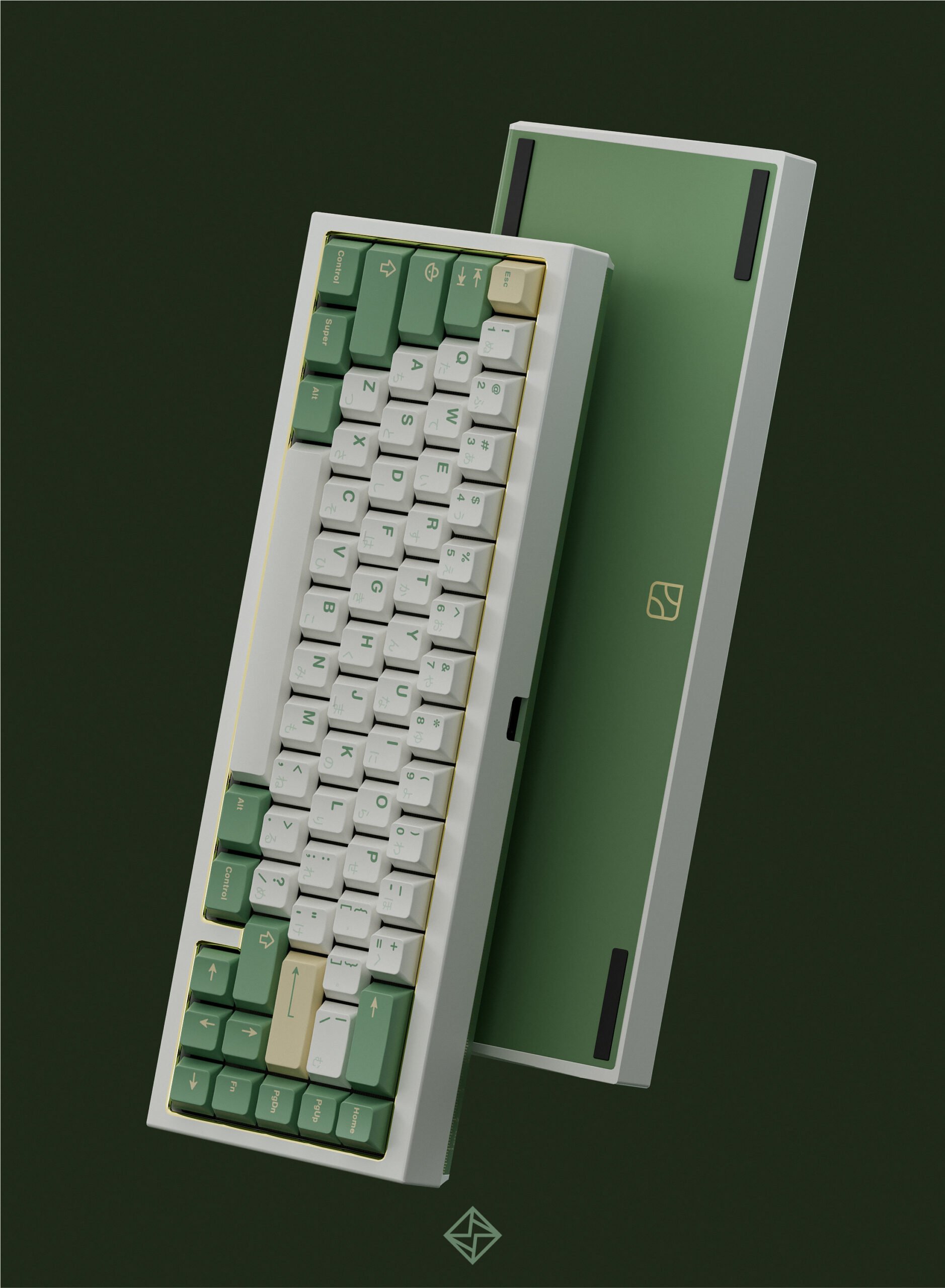
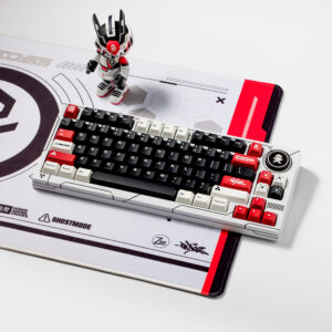
Compared to the standard version, this collab board has different weight color (which perfectly matches the MW STONE age color theme), and golden glossy chamfer on the inner edges (which echoes the yellowness on the keycaps).
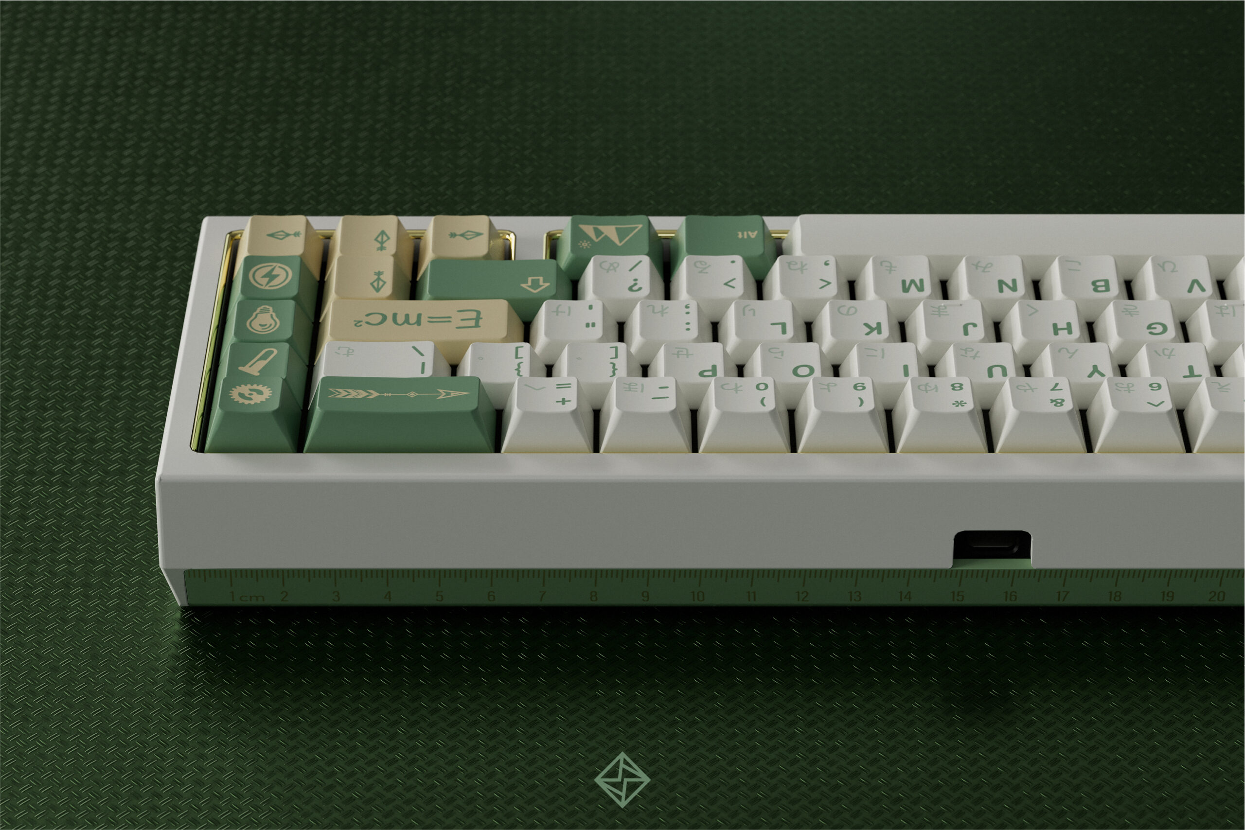
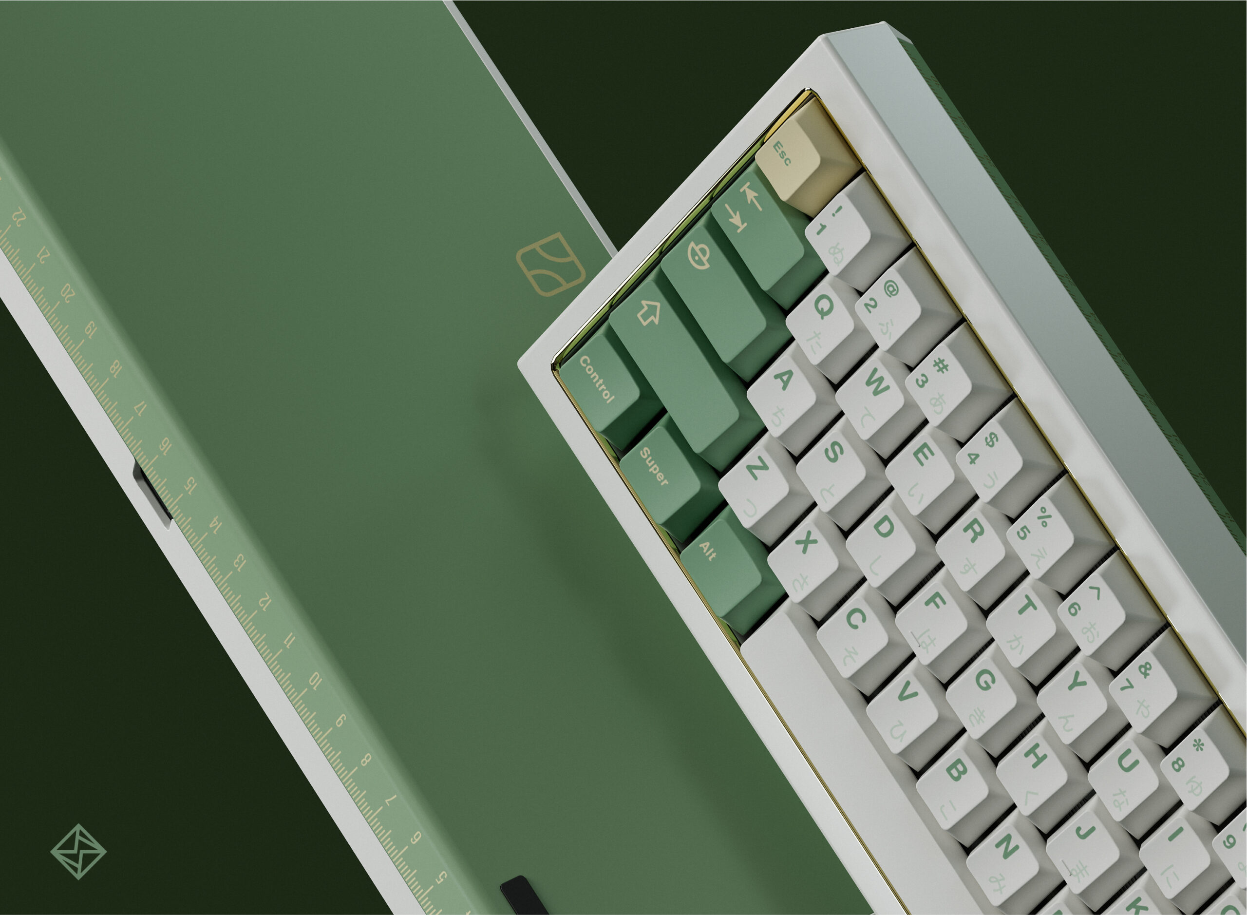
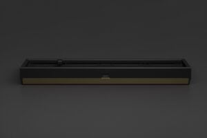
First, because the theme of this keycap set is related to science, so is the design of this keyboard, I have decided to put a scale ruler on the back of the board to express the preciseness and rigorousness of science. And I think this concise pattern will be more favorable.
Next, the logo on the back is the abstract combination of letters ‘Q’ and ‘K’ inspired by Bauhaus. The letters are embracing each other. I want to use this design to express the inclusiveness of the collaboration keyboard. This logo along with some similar designs can also be seen in the keycap set I designed for the QK65 standard version.
Additional information
| Weight | N/A |
|---|---|
| QK65 | QK65 x STONE AGE |
| PLATE OPTIONS | POLYCARB PLATE, FR4 PLATE, ALUMINUM PLATE, POM PLATE |
Reviews (0)
Only logged in customers who have purchased this product may leave a review.
Related products

Uncategorized
Ended Group Buys


Uncategorized

Uncategorized

Uncategorized
Uncategorized
Uncategorized
Uncategorized
Reviews
There are no reviews yet.